Copyright © All Rights Reserved.
Terence Aruta
Designer, PH—SEA
Aesthetic & Function
Copyright © All Rights Reserved.
Terence Aruta
Designer, PH—SEA
Aesthetic & Function
Copyright © All Rights Reserved.
Terence Aruta
Designer, PH—SEA
Aesthetic & Function
Copyright © All Rights Reserved.
Terence Aruta
Designer, PH—SEA
Aesthetic & Function
Copyright © 2024
Terence Aruta
Designer, PH—SEA
Copyright © 2024
Terence Aruta
Designer, PH—SEA
Copyright © All Rights Reserved.
Terence Aruta
Designer, PH—SEA
Aesthetic & Function
Tapputi
Beauty & Wellness
Brand
Design, Q4—’21
A Filipino beauty brand focusing on bespoke organic perfumes made with pure essential oil to promote health-beneficial fragrances.
Tapputi
Beauty & Wellness
Brand
Design, Q4—’21
A Filipino beauty brand focusing on bespoke organic perfumes made with pure essential oil to promote health-beneficial fragrances.
Tapputi
Beauty & Wellness
Brand
Design, Q4—’21
A Filipino beauty brand focusing on bespoke organic perfumes made with pure essential oil to promote health-beneficial fragrances.
Tapputi
Beauty & Wellness
Brand
Design, Q4—’21
A Filipino beauty brand focusing on bespoke organic perfumes made with pure essential oil to promote health-beneficial fragrances.
Tapputi
Beauty & Wellness
Brand
Design, Q4—’21
A Filipino beauty brand focusing on bespoke organic perfumes made with pure essential oil to promote health-beneficial fragrances.
Tapputi
Beauty & Wellness
Brand
Design, Q4—’21
A Filipino beauty brand focusing on bespoke organic perfumes made with pure essential oil to promote health-beneficial fragrances.
Tapputi
Beauty & Wellness
Brand
Design, Q4—’21
A Filipino beauty brand focusing on bespoke organic perfumes made with pure essential oil to promote health-beneficial fragrances.
Client
Tapputi™
Beauty & Wellness
Industry
Perfume
Health & Wellness
Cosmetics
Role
Art Direction
Brand Strategy
Graphic Design
Distinction
Stylish
Elevated
Nurturing
Scope
Logo
Packaging
Poster
Socials
Sticker
Stationery
Role
Brand Strategy
Creative Direction
Art Direction
Graphic Design
Distinction
Stylish
Elevated
NurturingScope

Ancient cuneiform tablet containing 3,200-year-old fragrance formula by a Mesopotamian perfumer, Tapputi-Belatekallim.

“From body essentials and cleaning mediums to home diffusers, consumers opt for fragrance oils due to the serious lack of advocacy for the mental and physical benefits of using pure essential oils. Tapputi is here to develop and promote them—in style.” Kim A., Founder.

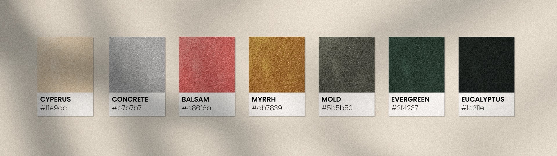
Tapputi’s name is inspired by the world’s first recorded chemist, Tapputi-Belatekallim, a perfume-maker mentioned in a cuneiform tablet from 1200 BC in Babylonian Mesopotamia. She used flowers, oil, calamus, cyperus, myrrh, and balsam for her pioneering endeavors.

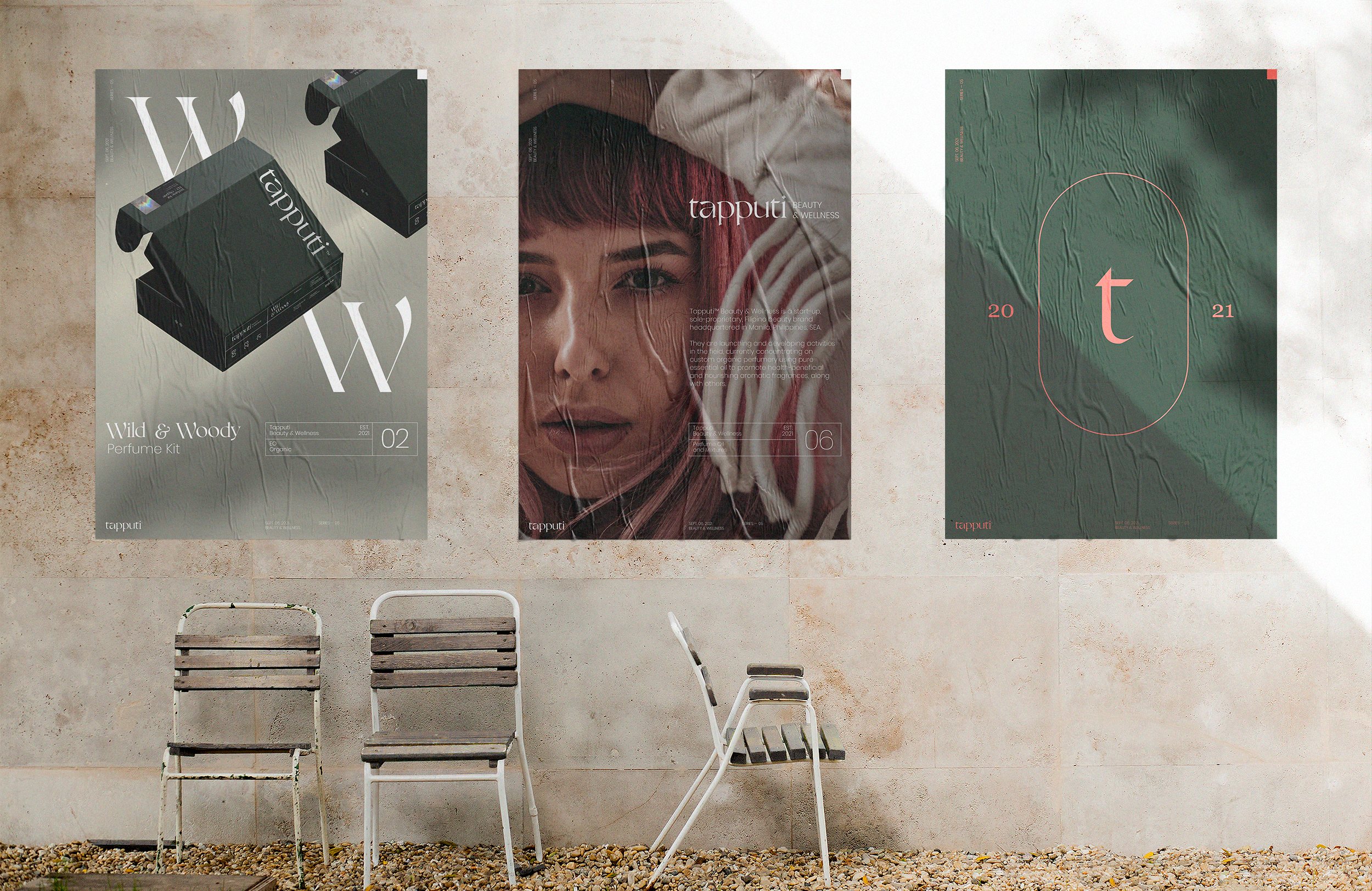
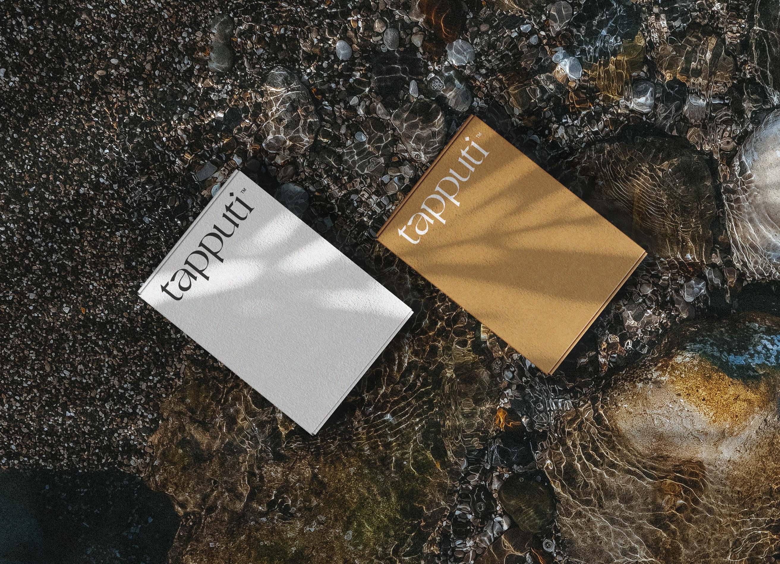
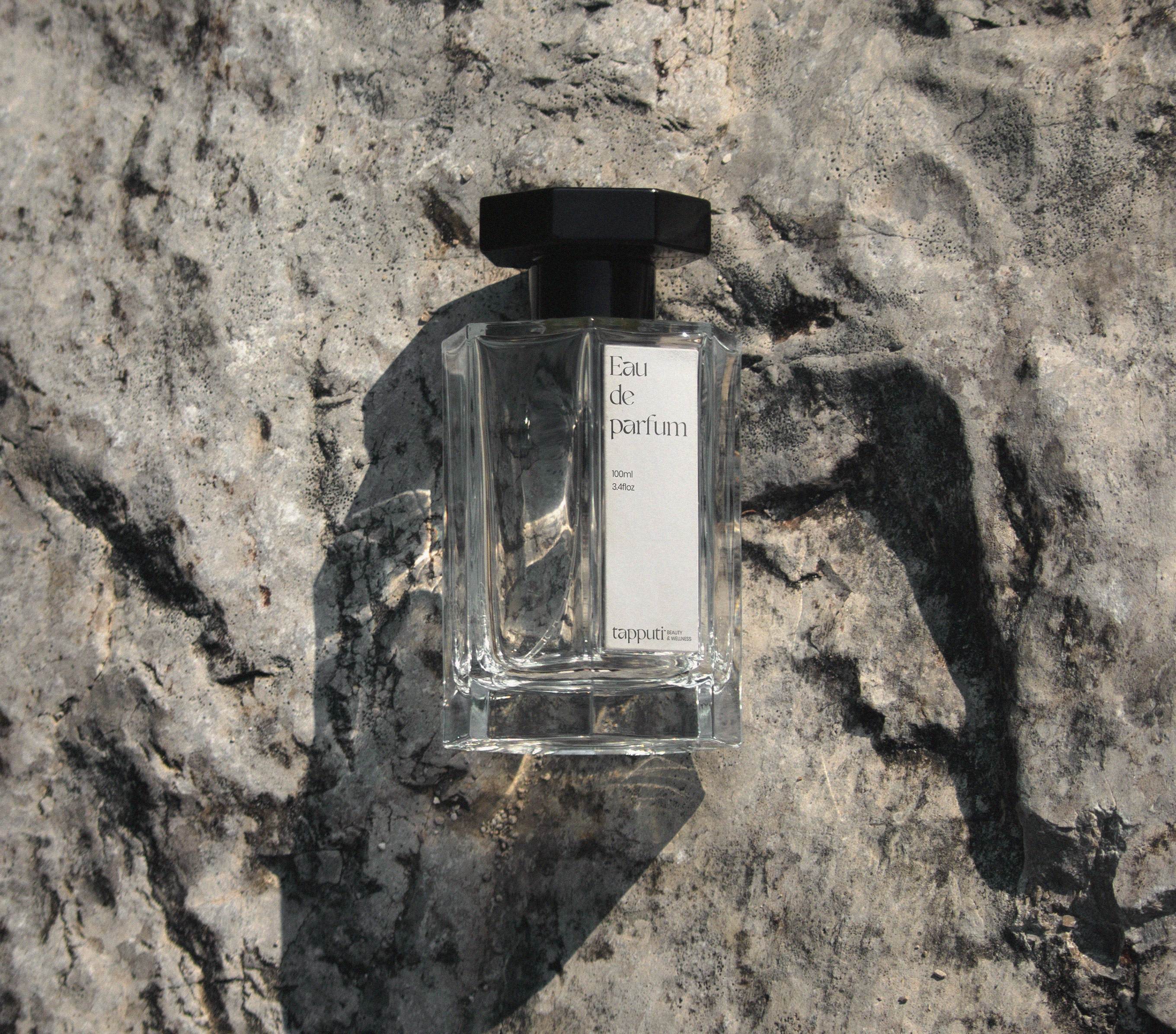
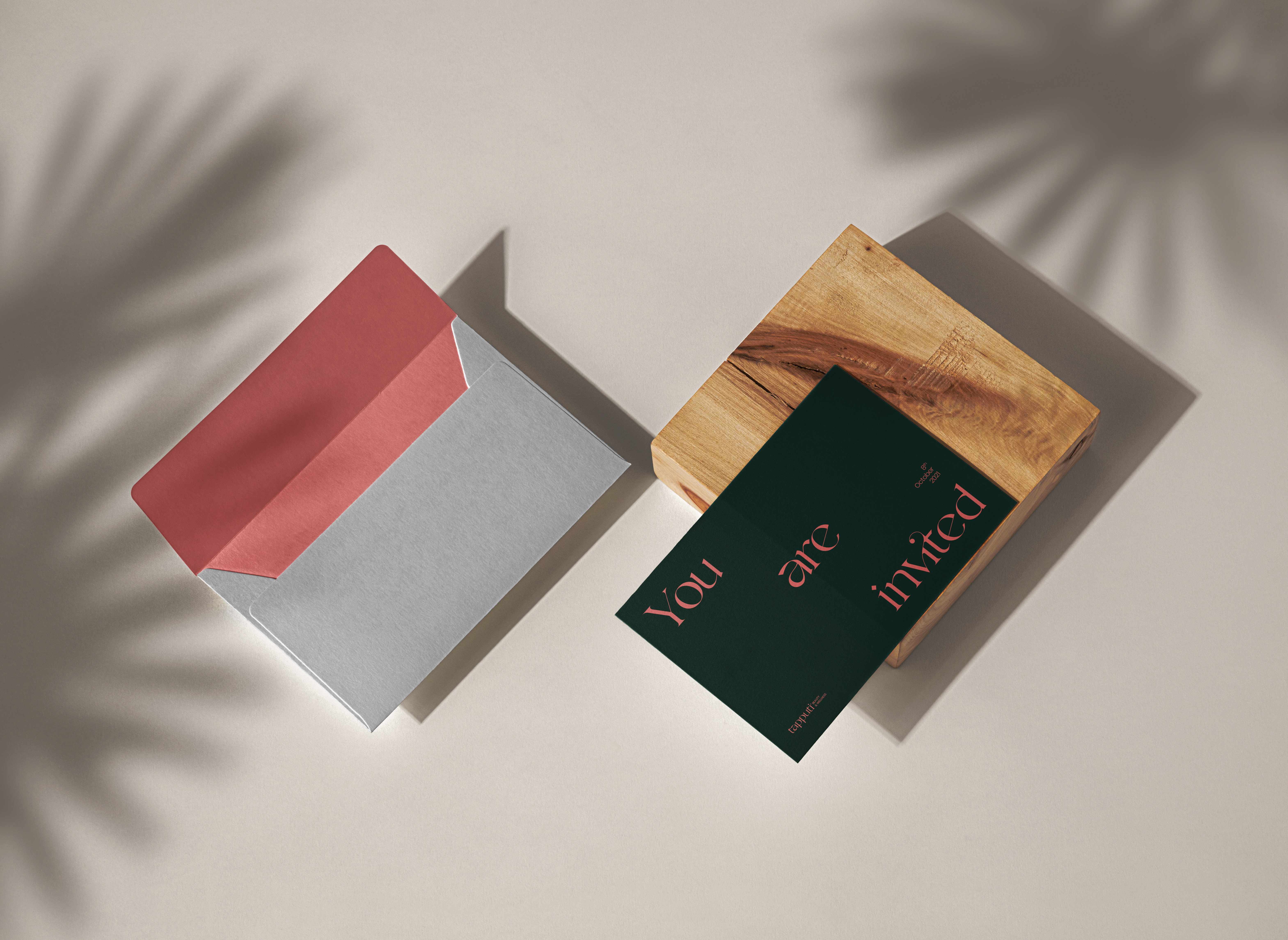
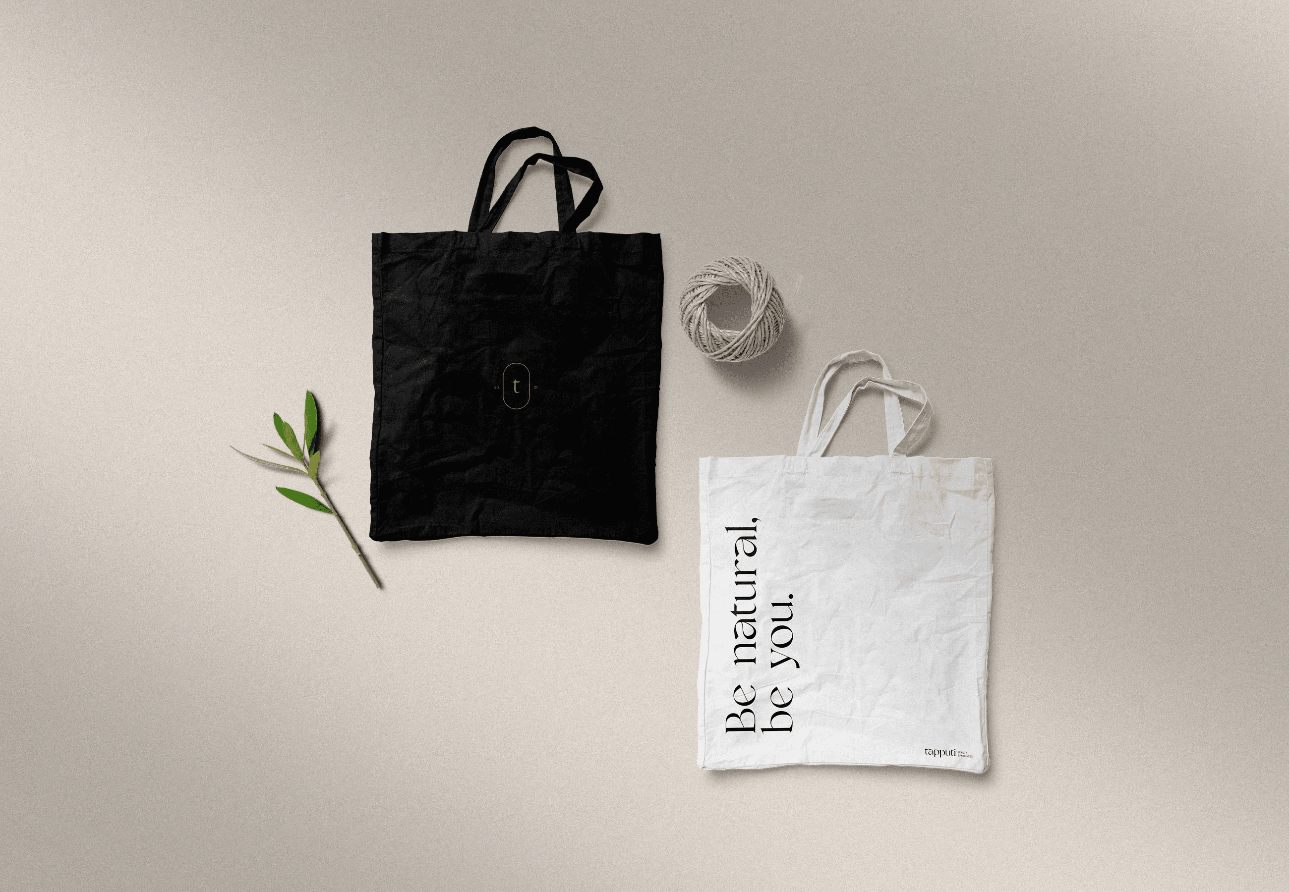
The goal is to develop an identity prioritizing a niche market segmentation of male and female users, predominantly the latter, with fittingly unique profiles. Outside of the usual logo system and a palette of colors, a packaging design for a perfume kit was requested to house their existing organic perfume line along with a plethora of print and digital deliverables.

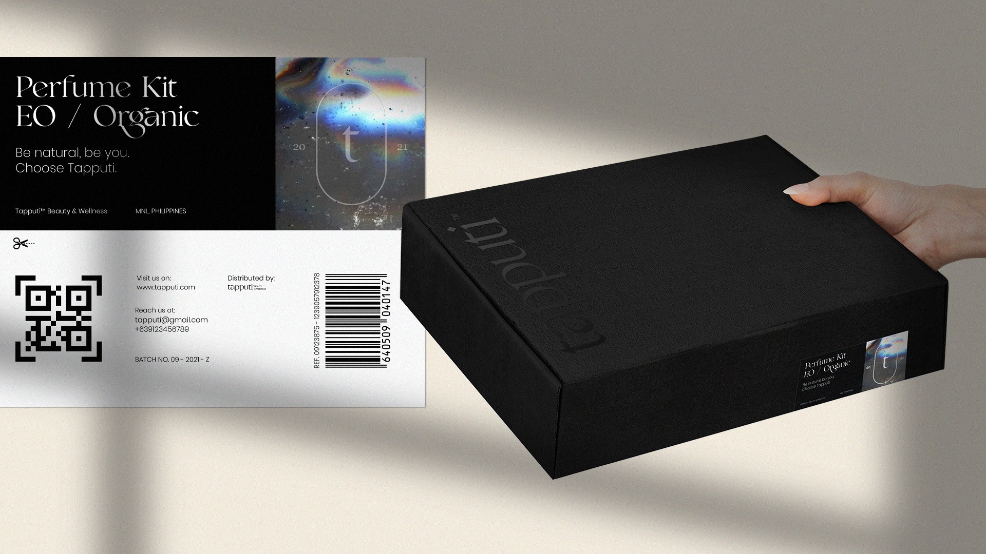


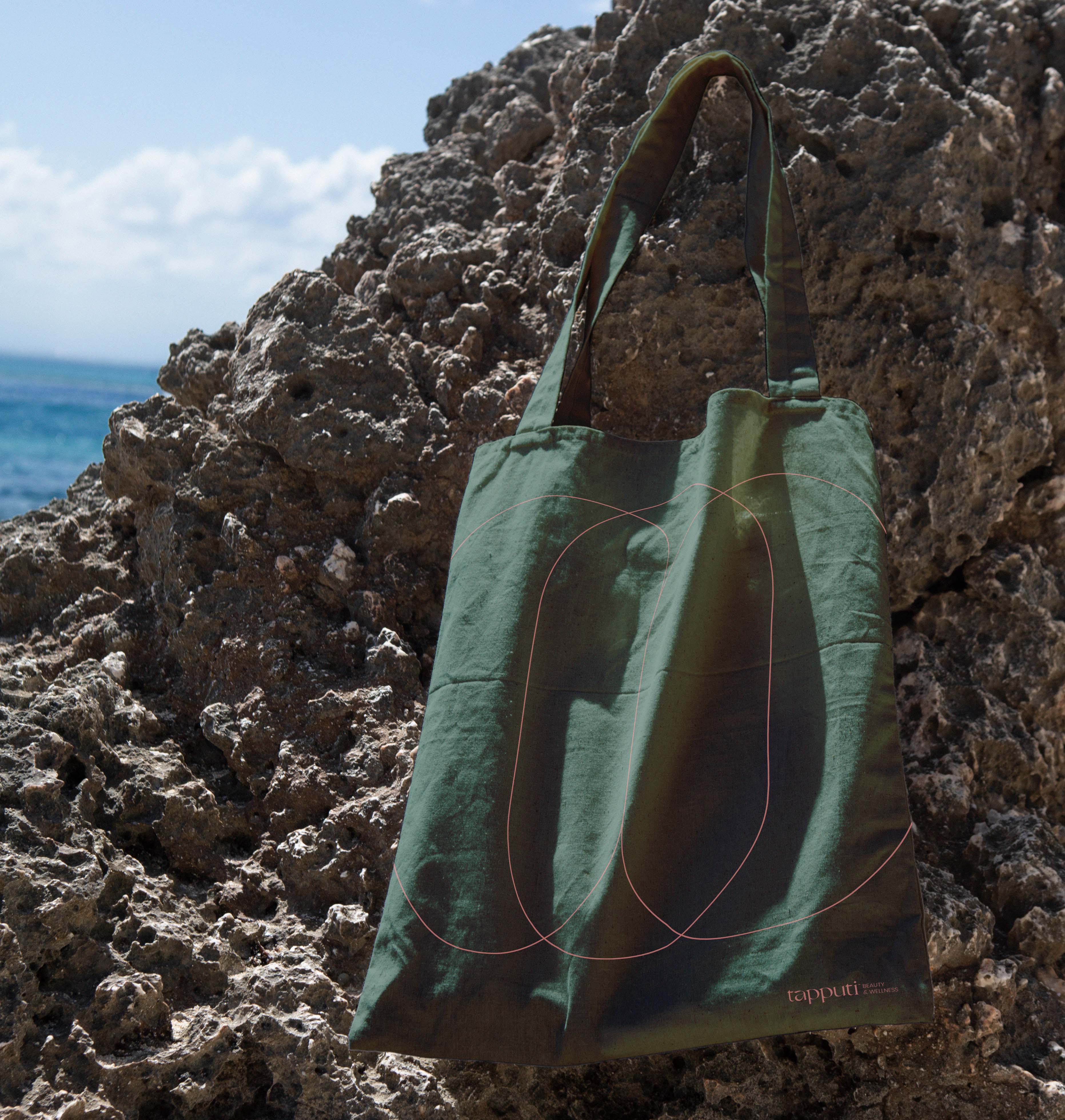
Key conceptual elements used across the identity are derivatives of the shapes, lines, and colors directly observable from the relic photographs, including the ingredients mentioned in Belatekallim’s time such as the brand mark taking its shape from the cuneiform tablet; the colors extracted from the oils and flora she used; the primary typeface resembling the organic cut of the stones; and the grids reminiscent of the carvings.
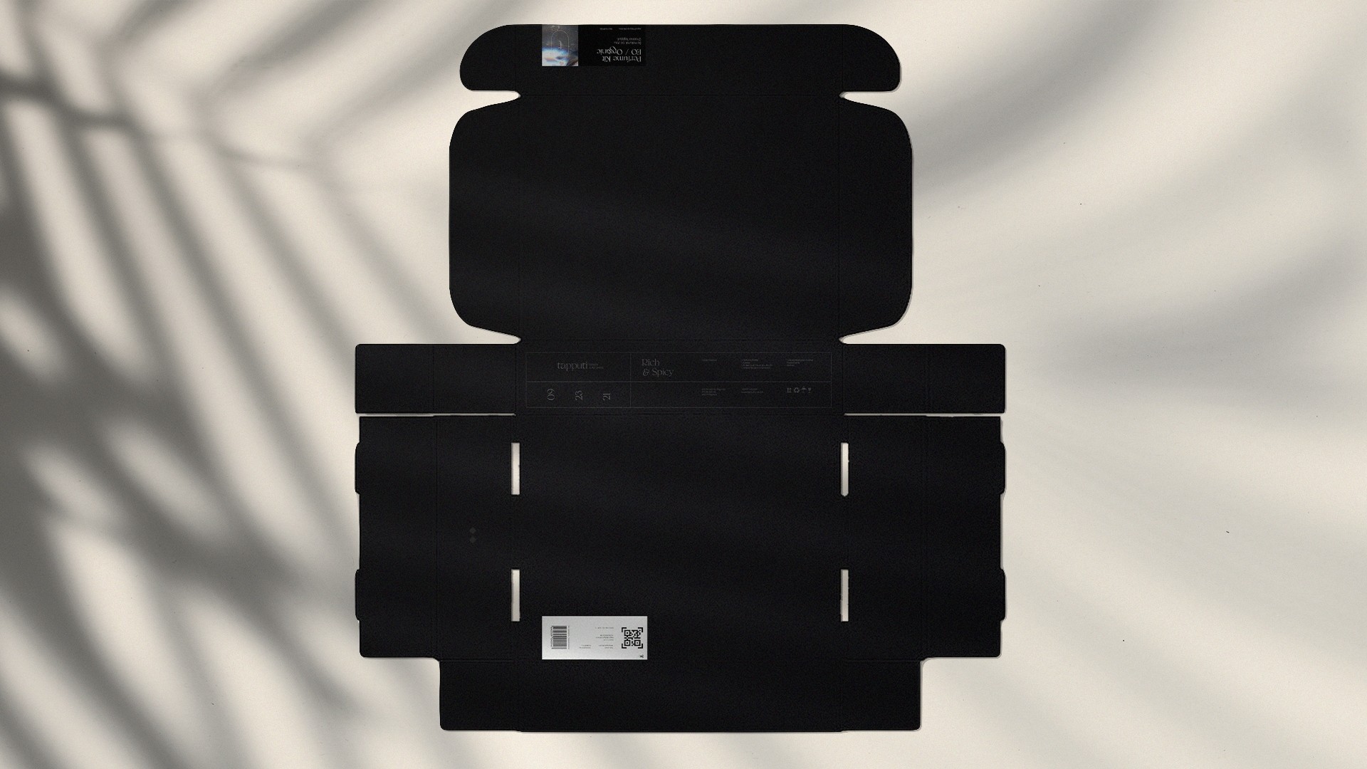


The distinctive forms and features of the stone artifacts were used as design references to showcase the perfumery’s roots and the industry’s historical practice. To streamline the identity for the intended audience, a modern visual language was imposed by using contemporary typographical treatments and voguish layout compositions.


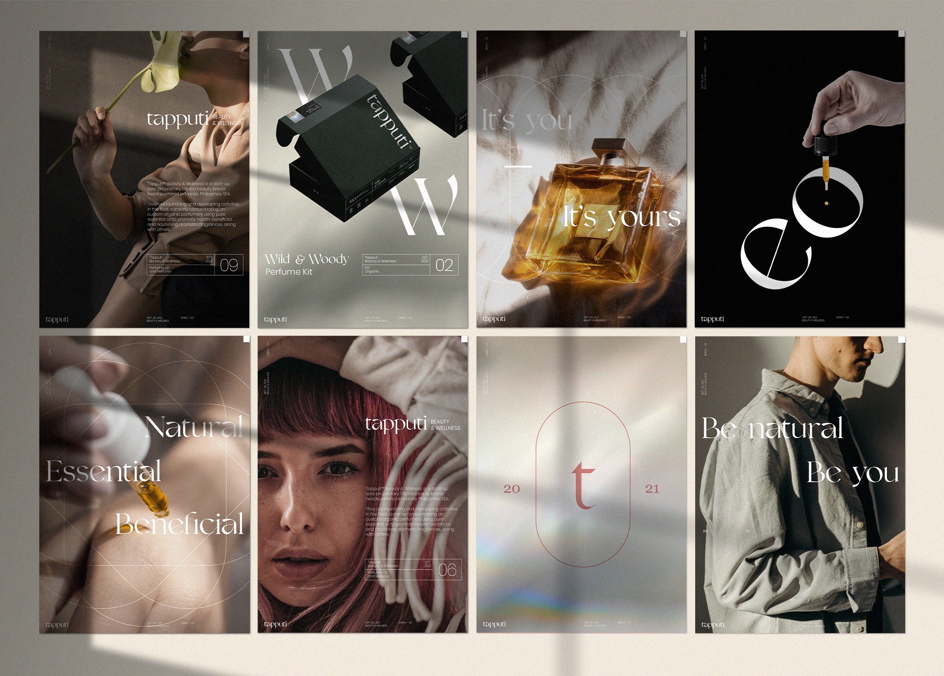
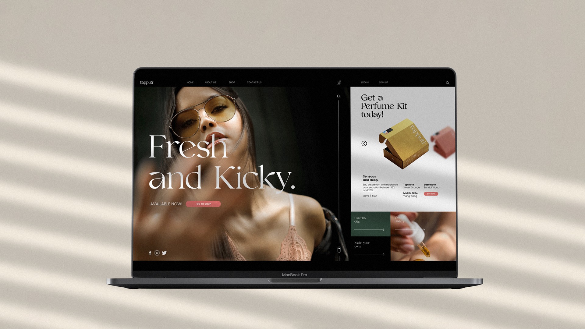


Focusing on Tapputi’s brand values satisfied the appropriate brand image to best serve their customers with products that effectively communicate and stand out. The overall direction led to a visual exposition that is stylish and relatively youthful with an elevated, nurturing aesthetic.
Client
Tapputi™
Beauty & Wellness
Industry
Perfume
Health & Wellness
Cosmetics
Role
Art Direction
Brand Strategy
Graphic Design
Distinction
Stylish
Elevated
Nurturing
Scope
Logo
Packaging
Poster
Socials
Sticker
Stationery
Role
Brand Strategy
Creative Direction
Art Direction
Graphic Design
Distinction
Stylish
Elevated
NurturingScope
Ancient cuneiform tablet containing 3,200-year-old fragrance formula by a Mesopotamian perfumer, Tapputi-Belatekallim.
“From body essentials and cleaning mediums to home diffusers, consumers opt for fragrance oils due to the serious lack of advocacy for the mental and physical benefits of using pure essential oils. Tapputi is here to develop and promote them—in style.” Kim A., Founder.
Tapputi’s name is inspired by the world’s first recorded chemist, Tapputi-Belatekallim, a perfume-maker mentioned in a cuneiform tablet from 1200 BC in Babylonian Mesopotamia. She used flowers, oil, calamus, cyperus, myrrh, and balsam for her pioneering endeavors.
The goal is to develop an identity prioritizing a niche market segmentation of male and female users, predominantly the latter, with fittingly unique profiles. Outside of the usual logo system and a palette of colors, a packaging design for a perfume kit was requested to house their existing organic perfume line along with a plethora of print and digital deliverables.
Key conceptual elements used across the identity are derivatives of the shapes, lines, and colors directly observable from the relic photographs, including the ingredients mentioned in Belatekallim’s time such as the brand mark taking its shape from the cuneiform tablet; the colors extracted from the oils and flora she used; the primary typeface resembling the organic cut of the stones; and the grids reminiscent of the carvings.
The distinctive forms and features of the stone artifacts were used as design references to showcase the perfumery’s roots and the industry’s historical practice. To streamline the identity for the intended audience, a modern visual language was imposed by using contemporary typographical treatments and voguish layout compositions.
Focusing on Tapputi’s brand values satisfied the appropriate brand image to best serve their customers with products that effectively communicate and stand out. The overall direction led to a visual exposition that is stylish and relatively youthful with an elevated, nurturing aesthetic.
Client
Tapputi™
Beauty & Wellness
Scope
Logo
Packaging
Poster
Sticker
Social Media
Web
Stationery
Distinction
Stylish
Elevated
Nurturing
Scope
Logo
Packaging
Poster
Socials
Sticker
Stationery
Role
Art Direction
Brand Strategy
Graphic Design
Industry
Perfume
Health & Wellness
Cosmetics

Ancient cuneiform tablet containing 3,200-year-old fragrance formula by a Mesopotamian perfumer, Tapputi-Belatekallim.
“From body essentials and cleaning mediums to home diffusers, consumers opt for fragrance oils due to the serious lack of advocacy for the mental and physical benefits of using pure essential oils. Tapputi is here to develop and promote them—in style.” Kim A., Founder.
Tapputi’s name is inspired by the world’s first recorded chemist, Tapputi-Belatekallim, a perfume-maker mentioned in a cuneiform tablet from 1200 BC in Babylonian Mesopotamia. She used flowers, oil, calamus, cyperus, myrrh, and balsam for her pioneering endeavors.
The goal is to develop an identity prioritizing a niche market segmentation of male and female users, predominantly the latter, with fittingly unique profiles. Outside of the usual logo system and a palette of colors, a packaging design for a perfume kit was requested to house their existing organic perfume line along with a plethora of print and digital deliverables.
Key conceptual elements used across the identity are derivatives of the shapes, lines, and colors directly observable from the relic photographs, including the ingredients mentioned in Belatekallim’s time such as the brand mark taking its shape from the cuneiform tablet; the colors extracted from the oils and flora she used; the primary typeface resembling the organic cut of the stones; and the grids reminiscent of the carvings.
The distinctive forms and features of the stone artifacts were used as design references to showcase the perfumery’s roots and the industry’s historical practice. To streamline the identity for the intended audience, a modern visual language was imposed by using contemporary typographical treatments and voguish layout compositions.
Focusing on Tapputi’s brand values satisfied the appropriate brand image to best serve their customers with products that effectively communicate and stand out. The overall direction led to a visual exposition that is stylish and relatively youthful with an elevated, nurturing aesthetic.